COMPOSITION
A well composed picture will not only look pleasing to the eye but will also depict a particular emotion, it will not just be an image but a captured moment. Composing good pictures requires practice, patiences, study and experimentation. Organising the various elements within the frame of the viewfinder in order to create an effective design is more challenging than it might seem at first. Effective composition of natural images is always a balance between arranging elements within the viewfinder and allowing a certain amount of disorder.
LINES
Lines add a great deal of visual and emotional impact to a picture, these lines can be leadings, oblique, straight/ curved, vertical, horizontal, diagonal, converging or even zig zag, or perhaps even suggested, i.e. several points placed geometrically within the picture to imply the presence of a line.
Different Lines and Their Impact on a Picture
Leading lines - Lead the eye to the main subject
Oblique lines - Action movements and change
Horizontal lines - Stability, tranquility and rest (e.g. horizons, oceans, etc)
Vertical lines - Power and strength (e.g. tall trees/ building, etc)
Converging lines - depth, scale and distance (e.g. road disappearing into the distance)
Lines can create effective photographs and are a powerful element regarding photo composition. You should actively seek out lines through your viewfinder and attempt to invoke specific emotions in your photography. Lines have the power to create depth to an image, add dynamism , attract attention to areas of interest and create a sense of direction and orientation.
Leading lines are able to lead the eye from one part of the picture to another, whether it is from the background to the foreground or from a secondary subject to the main subject, a successful leading line will lead the eye directly to the main subject or centre of interest. Diagonals or arcs are good examples of leading lines, these leading lines may take the form of roads, fences, shorelines, rivers, pathways, rows of trees, etc. Studies have suggested that people naturally study images from left to right so making your leading line start at the bottom left moving up to the top right allows a person to view the image more naturally.
When photographing the horizon, the horizon should not be placed in the middle of the frame, as this leaves the image feeling unsettled compositionally. Instead the horizon should be placed in the upper or lower thirds of the frame.
SHAPE
The way subjects connect to each other in a photo forms shapes that draw the eye from subject to subject. If the photo composition lacks shape, then the photo becomes too busy and awkward to appreciate. Primary shapes within the picture come in the form of circles, squares, triangles, and hexagons as these shapes often appear in nature in one form or another. However, some shapes are more effective than others in providing an interesting frame for your image. Triangles and diamonds tend to work best for composition whereas squares and circles, for example, tend to be too symmetrical and leave too much empty space around the subjects. Space is defined and determined by shapes and forms.
POSITIVE AND NEGATIVE SPACE
Positive space is where shapes and forms exist, negative space is the empty space around shapes and forms. In the photo below the black area is negative space and it serves to balance the area in which the fair ground rides occupy. Areas of a picture that contain "nothing" are important visual elements that provide balance in an image.
FORM
Form refers to the three-dimensional quality of an object. Light and shadow itself is partly responsible for the appearance of a three-dimensional look to an image, lighting coming from a single direction will immerse part of an object in light, leaving part of it in shadow, and it is these light and dark areas within an image which provide contrast that can suggest volume. The viewers feelings towards an image may also be affected by the direction the light is coming from (i.e. above or below) and the intensity of the light (i.e. the gentleness or abruptness of the half tones). Images with an absence of colour (i.e. black and white/ sepia) will often give us an enhanced perception of form. Silhouettes lack in form as they appear as two-dimensional shapes. silhouettes are a result of a light source being placed behind a subject causing the subject itself to appear black as the background remains light, providing a contrast between the two.
|

|
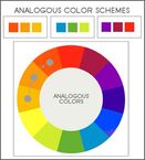
- The "Vocabulary" of Colour
Hue - one of the main properties of colour, hue refers to teh names of primary colours (Red/ Green/ Blue)
Value - The lightness and darkness of the colour (the amount of white of black added)
Intensity - The purity or saturation of the colour
Monochromatic Colour - The use of one colour where only the value of the colour changes
Analogous Colours - Colours that are adjacent to each other on the colour wheel (e.g. yellow and green)
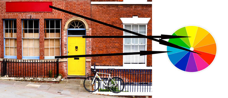
Complimentary Colours - Colours that are opposite each other on the colour wheel (e.g. Blue-violet and yellow)
Warm Colours - Yellow, Red and Orange, often associated with the sun, blood and fire
Cool Colours - Violet, Blue and Green, often associated with snow and ice
|
Example of Analogous Colours Analogous Colours are said to be harmonious with one another and can have a soothing effect when used in visual design. |
|
Example of Complimentary Colours
Complimentary colours will show a greater amount of contrast when placed next to each other (e.g. yellows appear more intense when positioned next to blue or violet).
Complimentary colours will show a greater amount of contrast when placed next to each other (e.g. yellows appear more intense when positioned next to blue or violet).
TEXTURE
Texture is the surface quality or "feel" of an object (e.g. smooth, rough, soft, etc).
- Tactile Textures - Textures that may be actual i.e. felt with touch
- Visual Textures - Textures that may be implied i.e. suggested by the way the image has been
created.
Texture is often emphasised in oblique lighting as it strikes the object from one side.
- Tactile Textures - Textures that may be actual i.e. felt with touch
- Visual Textures - Textures that may be implied i.e. suggested by the way the image has been
created.
Texture is often emphasised in oblique lighting as it strikes the object from one side.
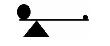
BALANCE
Balance implies that the visual elements within the frame have a sense of weight. Large objects generally weigh more than small objects and dark objects weigh more than light coloured objects. The position of the elements is also critical.
There are two forms of Balance:
- Formal Balance
The image may appear identical on each side of the picture, for example, a portrait of someone facing head on at the camera or scenery reflected in water. If the image were to be folded in two, both sides of the picture would be symmetrical.
There are two forms of Balance:
- Formal Balance
The image may appear identical on each side of the picture, for example, a portrait of someone facing head on at the camera or scenery reflected in water. If the image were to be folded in two, both sides of the picture would be symmetrical.
- Informal Balance
This form of balance produces a non symmetrical image where the picture shows dissimilar and contrasting elements on each side of the picture. We naturally see the centre of the image as the pivot, if a heavy 'weight' is positioned at one end of the picture, and a lighter weight at the other, the lighter weight is to be located at a further distance from the 'pivot' to attain balance. In other words you must think about how to compose your picture to create this balance.
UNITY
Unity refers to the unified ordering of elements within an image, though unity without variation can be uninteresting, it is therefore suggested to add variation within unity.
DOMINANCE AND SUBORDINANCE
Dominance and subordinance is about controlling elements in an image and choosing which elements you wish to draw the most attention to. Making an element dominant can be done through size, colour or positioning of an element in the frame, i.e. larger objects dominate smaller objects and warm coloured objects dominate cooler pale objects. When positioning objects, it's best not to place your dominant element in the centre, either side from the centre of the frame is more suitable.
Another method to achieve dominance is through convergence or radiation or lines. The eye tends to follow these lines to the point where they converge.
Dominance can also be achieved through nonconformity, i.e. difference or exception. If all the elements are similar and one is different in colour, tone or shape it will stand out and become dominant.
COHERENCE
Coherence is when parts of an image may show a sense of unity through shape, size and colour. Visual coherence can be achieved through similar shapes, colour, size, or texture. If subjects are too similar in appearance, however,the image can become boring so it is suggested to add a little variety within the image.
RHYTHM
Rhythm is a regular repeating pattern of elements in a scene, a familiar repetitiveness can be soothing and enjoyable to view though like with coherence, if the rhythm of a picture is too perfect and without variability the image may be perceived as boring so when looking for rhythm whilst composing your picture, also look for variation.
CHAOS - SIMPLICITY VS COMPLEXITY
Chaos is a disorder of elements and is frequently found in nature. The goal of many photographers is to take pictures that display some underlying organisation so the viewer see's what the artists intend for them to see whilst leaving enough chaos within the image so the viewer must put forth some effort to explore and fully appreciate the image. An image which is too simple fails to hold the viewers attention for a prolonged period of time (such as the 'example image' above). Although it has interesting elements it fails to hold the viewers attention for long. This can be compared to the image below which displays a greater degree of complexity incorporating many textures and patterns for the viewer to explore and examine, keeping the viewer interested.
THE RULE OF THIRDS
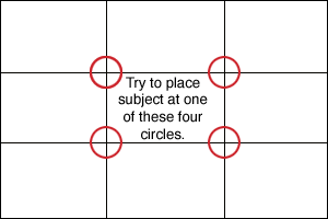
The Rule of Thirds is a popular 'rule' amongst photographers and artists alike. It is based on the fact that the human eye will naturally view images at the points of intersection as highlighted in the above image in red, thereby placing your main subjects in these points will make viewing the image much more natural and easy on the eye. Points of interest may also be placed along the lines such as horizons. Horizons should be placed either in the upper or lower thirds of an image but seldom in the middle. Placing the horizon in the upper third of the frame will place emphasis on the land or water, placing the horizon in the lower third will place emphasis on the sky. It is up to you as the photographer to decide which you wish to place the most emphasis on. Using the rule of thirds can also give an image a sense of balance and create an image which reflects good composition. These 'rules', however, are best used as guidelines and if you can create a better image by bending or ignoring these rues, do so. Though if you intend to break a rule of composition, you should always learn it first to make sure your breaking of it is all the more effective! You may wish to experiment with some of your older images by cropping to comply with the rule of thirds and see what impact it might have on your photos.
THE GOLDEN MEAN (AKA GOLDEN SECTION/ PROPORTION/ RATIO)
The Rule of Thirds is basically a simplified version of the Golden Mean, or Phi Grid. Like the Rule of Thirds, the Golden Mean also has its own set of points in which to place important elements called the 'Golden' points, although these points are closer together than in the Rule of Thirds.
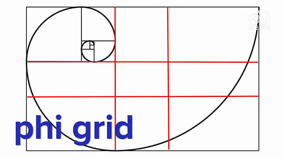
THE GOLDEN SPIRAL (GOLDEN RECTANGLE)
In the 12th Century, Fibonacci produced a series of numbers by adding together pairs of numbers like so; 0, 1, 1, 2, 3, 5, 8, 13, 21, 34, 55, 89, 144 etc. Each number is created by adding together the two previous numbers. The ratio between each successive pair of numbers gets closer and closer to the Golden Ratio. This process produces spiral known as the Golden Spiral, you want to place your point of focus in the tightest end of the spiral for the biggest impact. The Golden Spiral can be rotated in the frame or inverted from top to bottom so you can create more variety when you are composing pictures.
GOLDEN TRIANGLES
Using Golden Triangles is more convenient for photos with diagonal lines. There are three triangles, each differing in size. Roughly place three subjects with approximate equal sizes in these triangles.
